SKY Hospitality Visual Identity
When a regional hospitality association rebranded and needed an identity as big as the industry it represents, we built one from the state up.
The Situation
SKYHA — formerly the BG Area Lodging Association — rebranded under a new name in late 2022, stepping into a bigger role representing an industry that employs more than 10,000 people in the region and drives over $70 million annually into Southern Kentucky's economy. The name was new. The identity wasn't keeping up. What they had was technically a logo — low quality, inconsistent across applications, and carrying none of the weight the association had actually built. For an organization that convenes hotel groups, tourism operators, and regional hospitality leaders, looking like a placeholder wasn't just an aesthetic problem. It was a credibility problem.
The Solution
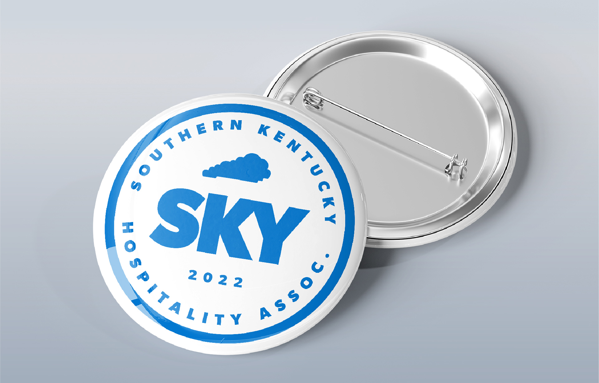
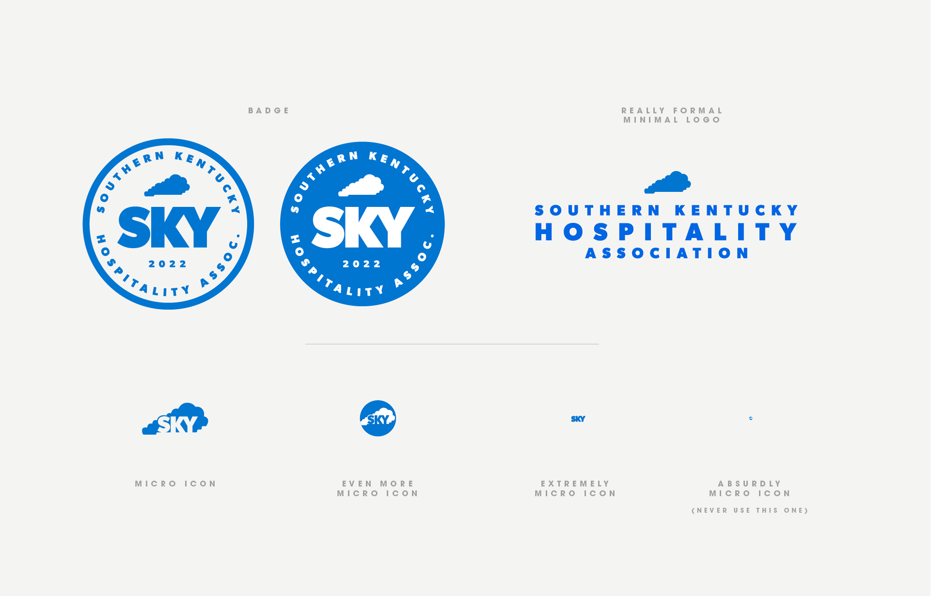
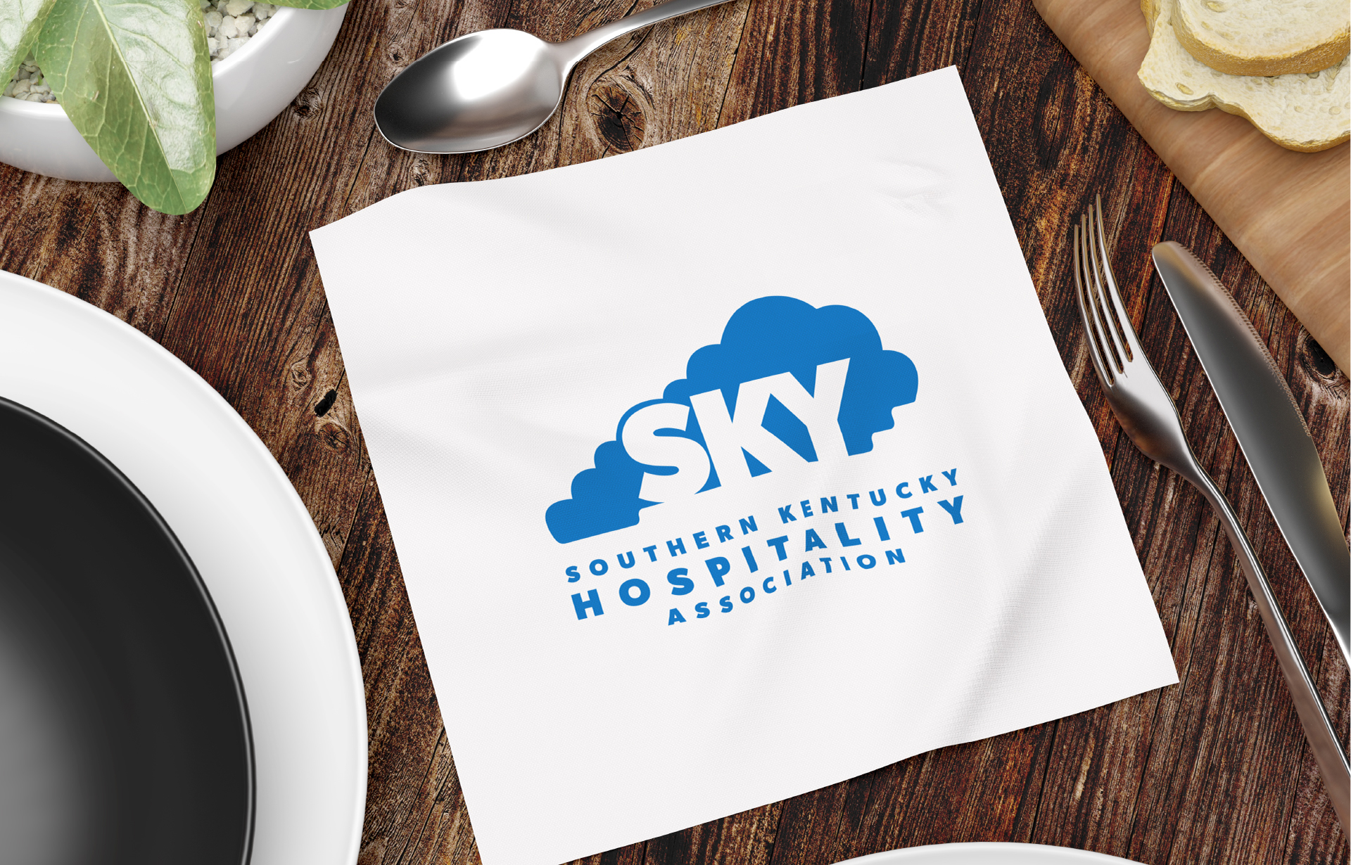
The brief was clear: build something bold enough to represent an entire region's hospitality industry, flexible enough to live everywhere from conference signage to cocktail napkins, and distinctive enough to hold up for years. The mark centers on a custom cloud silhouette — shaped to echo the outline of Kentucky — with "SKY" integrated directly into the form. The result is a logo that earns its name twice: it reads as sky, and it reads as place. Finding the right silhouette was the hardest part of the job. Dozens of variations were tested before the shape clicked — tight enough to be iconic, loose enough to feel friendly. The full deliverable was a complete adaptive logo system: primary mark, circular badge, formal minimal lockup, and a full suite of micro icons scaled down to favicon level (with one version explicitly labeled "never use this one" — which is exactly what a good brand standards doc is for). A color palette, graphic patterns, and typography rounded out a system built to stay consistent whether it's on a member badge, a napkin, or a stage backdrop.
The Result
SKYHA has been running the identity ever since. The client's reaction: big, bold, friendly, and future-forward — exactly the register a growing regional association needs. The system has held up across print, digital, event collateral, and merchandise without modification, which is the quiet proof that the foundation was right.